Friday, October 28

Briefing a Better Logo. Part 3


This is a 3 part guide for Small Business Owners, and new business start ups to guide them though how to work with a freelance designer or agency when setting up their brand. Part 1 was published on Monday 24th and Part 2 on Wednesday 26th of this week.

Parts 1 and 2 covered the how to approach the brief when putting together the scope and direction of work for briefing a designer, you should now have a very detailed page of answers that give the designer enough guidance to be creative, but doesn't strangle the life out of the work. 

Now we're going to look at how to select the right designer or agency for the job, and touch on some of the warning signs.

1. Portfolio

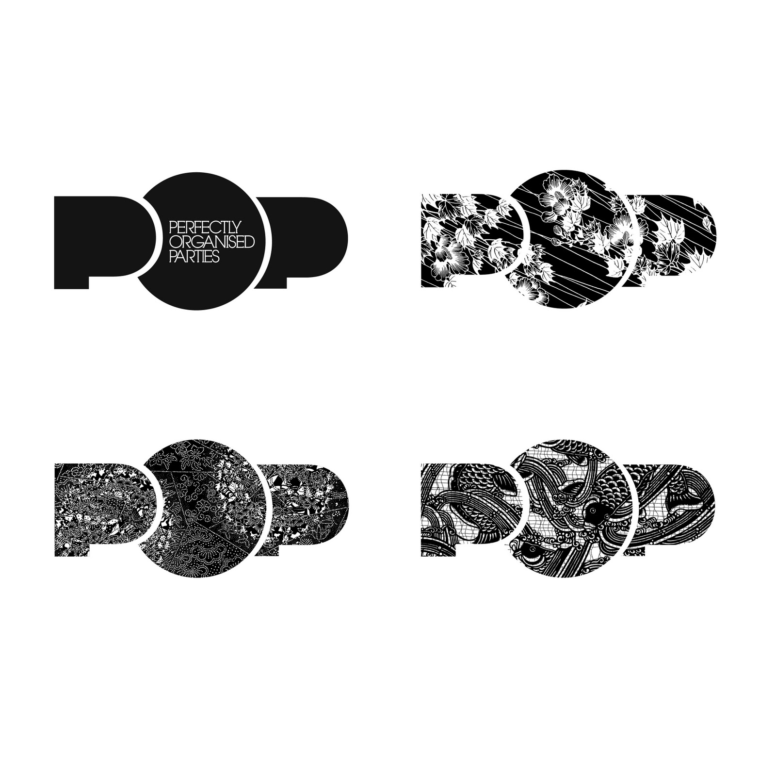
Clearly a good portfolio is essential here, look for experience with a variety of brands, some big brand touch points, and some start up brand creation. Look for actual product photography of brands in-situ, and  don't be afraid to ask the designer which work is conceptual (so didn't make it to the real world) and which is operational, and being used. It really doesn't matter, good work is good work, but there should be a good mix of both.


2. Be Honest

After an agency has pitched their work they should always give you 3 options;

1. Pick one design and develop it further
2. Combine 2 or more of the ideas
3. Back to the drawing board.

Don't be afraid to send them back if nothing hits you in the guts from the start, you can't hurt a good designers feelings (that's probably not true, bet you could if you tried), and it's important you get something you love. This shouldn't cost you extra, but it depends on your agreement.


3. Pitch Options

In my experience it takes about a day or two to produce 3 good options, but I've seen designers promise so much more, and it's alway made me question how much thought they're putting into the work. Beware of designers promising 10+ variations of your logo, this is bad for a few reasons, firstly they clearly haven't understood your brief and secondly they're probably using stock logos, that they alter the wording on, and submit as bespoke work. If you've followed all of the steps on the Brief Builder in parts 1 & 2, your designer should be able to hit your requirement in 3 carefully crafted options.


4. Always get a Full Logo Suite

Once the logo is created and signed off, make sure you get it in all of the formats you'll need, these are;

• Full Colour Outlined EPS (Saved as Illustrator 10 to be safe)
• Black Mono Version EPS
• White Version EPS

• Full Colour Outlined GIF
• Black Mono Version GIF
• White Version GIF

• Full Colour JPEG
• Black JPEG


5. Develop this into a Brand

The next step is to develop this into a full blown brand, with a manual that any designer or agency can pick up and work easily with, we'll look at this next month.


Right, now, did I mention that Citizen design logos? Take a look at our work here, and if you want to meet up and go through a more extensive portfolio then please get in touch.


Read the whole Series.


Or call 07764 898 010

Wednesday, October 26

Briefing a Better Logo. Part 2


This is a 3 part guide for Small Business Owners, and new business start ups to guide them though how to work with a freelance designer or agency when setting up their brand. Part 1 was published on Monday 24th and Part 3 will follow on Friday 28th of this week.

Now, if you've been good and read Part 1 of Briefing a Better Logo you should have your answers to the Brand Foundations Questions, these are what your designer will start to build their ideas on, but before we let the creatives loose, we need to drill down into the brief further, and look at the form we want to logo to take.

There are 6 basic logo forms, let's go through these now.

1. Wordmark 
A wordmark consists of the company name in a stylised type and may include small abstract or pictorial elements. A famous example of this would be the FedEx logo.


2. Pictoral Mark

A pictorial mark uses literal or representative imagery to symbolise the brand. A famous example of this would be the Apple Logo.


3. Abstract Mark
Uses abstract shapes and symbols to convey an idea or attribute about the organization. An example of this would be the Olympics logo.


4. Letterform

An example of this would be the Olympics logo. Typically uses a very small amount of letters (1-2) to represent the organization. 


5. Emblem
An emblem features the name of the company typically enveloped by a pictorial element or shape. An example of this would be the StarBucks logo. 


6. Web 2.0
Although there is no official description of "Web 2.0" logos, some common elements can include: vibrant colors, subtle 3d feel, bold type, color transitions, and shadows. An example of this would be the Skype logo.


Armed with this level of detail, and your Brand Foundations from Part 1, you'll be on the right path of creating the perfect brief for your designer, they now have the tools to deliver exactly what you're looking for. BUT WAIT, there's a few things to look out for when choosing the right designer for your brief. 

In Part 3 published on Friday 28th, I'll outline some of the thing to look for in a designer or agency, and some of the common bullshit they'll start to drop on you when they're looking for the work.


Read the whole Series.


Or call 07764 898 010

Monday, October 24

Briefing a Better Logo. Part 1


This is a 3 part guide for Small Business Owners, and new business start ups to guide them though how to work with a freelance designer or agency when setting up their brand. Parts 2 and 3 will follow on Wednesday 26th and Friday 28th of this week.

In Part 1 of Briefing a Better Logo I'm going to look at how to prepare a brief for an agency when you want a new logo, later we'll talk how to develop this, and some of the hollow promises to look out for from crappy designers.

I'm not going to talk about specific design, form or typography, but the route to a successful logo through the focussed communication of ideas.

To begin with you need to consider three questions, you need to discuss these internally and form succinct, honest and non-bullshit responses all of which avoid the terms 'Out of the Box' and 'One-Stop-Shop'. 

Brand Foundations Questions.

1. What do you want to say?
What is your proposition, what do you do, what is your Twitter Pitch?

2. Who do you want to say it to?
Who is your target market, what do they do, what do they like, how do they talk?

3. Why do you want to say it?
What makes you special, what makes your products different and what can you leverage from that?


With these questions answered you have the foundations of a solid brief, and something that a designer will be able to instantly start putting ideas together with. 

Everything you've learnt here should go into each tiny form of the logo, these answers will help evolve the colours, the typography, the emblem and the wording on the logo, but this isn't enough, to get exactly what you want you need to drill down into more detail, and I'll tell you how to do that in Part 2 on Wednesday 26th October.


Read the whole Series.


Or call 07764 898 010

Thursday, October 20

POP Goes the Logo


I'm currently working with Perfectly Organised Parties, and we've just finished an EDM campaign that promoted a recent piece about the company in the October Vogue Magazine, we decided maybe this was a good time to give the company a facelift, so we got busy working on logos.

I've created a logo that's a badge for the company, it's something what can be used in it's above form, or with copy (below), but most importantly we can use the space for patterns and illustrations that can help keep the brand fresh, react to seasonal trends or gear themselves towards a client.


The Logo is like an event, it's a blank canvass, and together we can decorate it and present it exactly the way we want it. It's a mini event, perfectly formed, unique sometimes, functional, when it needs to be.


UPDATE.

Just created some Stationery concepts to support the brand:


Or call 07764 898 010

Tuesday, October 18

You'll like this, not a lot...


Just found this this statistic on All Facebook, it confirms what I think we all knew, that Paul Daniels Facebook page is the 15th least popular page in the world. 

I'm not sure how this is calculated, but it's a sad statistic for the one time magical-pint-sized-TV-mainstay.


Or call 07764 898 010

Monday, October 17

Make a Newsstand - On The Edge


The recent upgrade to iOS5 bought the virtues of Newstand to my iPod, which got me thinking, newspaper and magazine sales have been on the decline, you only have to look at these figures for the first half of 2011 from the Press Gazette and you can clearly see that a lot of publications are in decline.

The launch of Newstand (and other similar platforms) is a genuine lifeline for a suffering industry, and has made what was a confusing proposition for online content, into a clear and future-proof revenue stream. 

That must be great if you're a magazine publisher, however that doesn't mean BADLY PDF'ING YOUR MAGAZINE AND SELLING IT FOR £6!

I've purchased a few online publications, my favourite being The Times, which makes full use of the iPad screen, divides sections up clearly, has a beautiful drop menu and navigation system and supports video content. The Guardian is also good, but lacks a little clarity in the structure, and isn't as easy to browse through. The worst, and the reason for this article, is Edge Magazine, which has literally PDF'ed the print edition and supplied it to Newsstand. The detailing of this is so bad, that double page spreads aren't even matched up properly and you end up with pages looking like this:


It's worrying to think that these publications have been given a life-line and they're risking throwing it away by not embracing or understanding the technology or the user. Along with the poorly aligned pages, there's no other functionality to the magazine, so no embedded video, and only one clickable link. There really is so much potential here, especially with a publication for a visual medium like games, it's a huge risk to launch your product half-baked like this, how did nobody understand that?

So, the big news is, Mr Benjamin Brown will not be buying a digital copy of this particular magazine again, and it'll make me think twice before spending money on any publication through Newsstand. It's disheartening to think that being given a second chance in what must be desperate times at the publication, they've not recognised the potential of the proposition and consequentially damaged their brand in this way.

Thank god Karen subscribes to the paper copy of Heat, which is course I never read.


Or call 07764 898 010

Wednesday, October 12

Deconstructing the new JJB Sports Logo

OK, I admit this is probably an easy target, we're not talking about a very prestigious brand here, but you can't help what annoys you can you? 

As soon as I saw the logo on TV it stuck in my throat like a half eaten cough sweet, and I've felt the jagged edges sliding down my esophagus ever since, I'm hoping this article will be the drink of water that washes it down into the pit of my guts forever.

JJB are probably the only business to have benefitted from the riots this summer, so perhaps their clientele don't care much for the way a logo looks, as much they as they care for how it makes cheap pair of tracksuit bottoms cost, but guess what? I do.

So, what was it? Was it the 2.0 ness of it? The cheap multi layered plaque effect? No, it was the angles created by the type that made this such a awkward piece of work.

The above diagram shows what leapt out to me when I saw it, the first two J's create 'Angle B' which contrasts against 'Angle B', but this could have been OK, if they didn't use the same typeface, but smaller for the word 'Sports'. By Shrinking this typeface down, the angles no longer match with the typeface above, and they create 'Angle C' which when put all together make a real mess that's genuinely uncomfortable on the eye. This is demonstrated where angles A and C intersect.

The solution to this would have been to use a different typeface for 'Sports' to negate the angle problem and smooth the whole thing out. But then again, what do I know, I don't even own any tracksuit bottoms, do you?


Or call 07764 898 010

Monday, October 3

The Bad Sleeves. No.1: Kasabian - Velociraptor


In the first of the series of what will obviously run into the thousands, I've decided to tackle the cover for the new Kasabian album, Velociraptor, a cover so woeful that upon seeing it, this (soon to be) long running feature was born.

Kasabian have a sordid history of terrible covers, and themselves are a terrible cover of every single rock and roll cliché ever written, in every copy of Mojo they've ever skim read. I've always believed that if you want to make a credible sequel to Spinal Tap, you could not go far wrong than to follow these bozos around for a year.

The reason I hate this cover, is because I know exactly how it happened. I've been there when you've got an 'alright' illustration, but it's a strange shape, somethings you can't make it sit interestingly on the page, so you try juggling it around and then duplicating it until you end up with something like this. You briefly have a moment of thinking it's good, then you get a cup of tea, sit back down and delete it. This last part tragically never happened, and somehow it's been (probably) been pressed to 20,000 gatefold pieces of vinyl, that the band insisted on releasing (probably) at the budgetary detriment of the jobs of two juniors at the record label.

There's two things that I thoroughly dislike about this, the first is that all the heads are the same, I think if they'd all been different illustrations, I'd have just thought it was terrible and forgotten about it. The worst thing about it is, the negative space that the heads create, it's a shape that's nearly a swastika (that could have been so Bowie man!), but it's not, it's the most eye catching part of the design, and it's NOTHING but a hole for the typography to sit in (which is terrible by the way).

A great designer would have created the heads in a way that when put together created something relevant to album and the band, and made this work visually on a another level, this could have made this potentially a great cover.

It annoys me because this kind of work is nearly impossible to get these days, and these sleeves literally stay around FOREVER, and designers have to think about that all the time they're working on it. The work is so half-baked, so nearly a good idea, and so lazily executed that I'm as cross as I'm jealous that someone has so many opportunities they can afford to let even one slip away and not produce something beautiful.


Let me know if there are any covers you'd like me to review, or if you've got one you want to rip into for this blog.


Or call 07764 898 010